Today has been Earth Day.
I remember the first Earth Day in 1970. Many of us who consider ourselves "environmentalists" today were a little unsure at the time if the promulgation of Earth Day might have been an attempt to distract us from the Vietnam War. Nowadays, I realize that concern for the sustainability of Earth systems, and for peace, social and environmental justice for its inhabitants are not mutually exclusive.
Ben Goossen is a historian at Harvard University whose current book project, “The Year of the Earth (1957-1958): Cold War Science and the Making of Planetary Consciousness,” offers a global history of the International Geophysical Year. At his website, you can download his very interesting article, "A benchmark for the environment: big science and 'artificial' geophysics in the global 1950s" (Journal of Global History, 15:1, 149-168, 2020). (As a geophysicist, for reasons I may return to, I'm not so keen on his use of the term artificial.) Among so much content in this article, Goossen discusses the importance of the IGY in forging global perspectives of Earth systems science and the environment. In particular, he mentions the groundbreaking work, started during the IGY, of Scripps Institution of Oceanography scientist Charles Keeling, whose program of carbon dioxide measurements in the atmosphere was perhaps one of the most significant endeavors of the IGY.
In this 2008 video, Keeling describes his early work and its relationship to the IGY:
I think my friend John and I made a manometer together in 9th grade (?) science class, but we fudged the procedures to maximize our chances for a successful class demonstration.
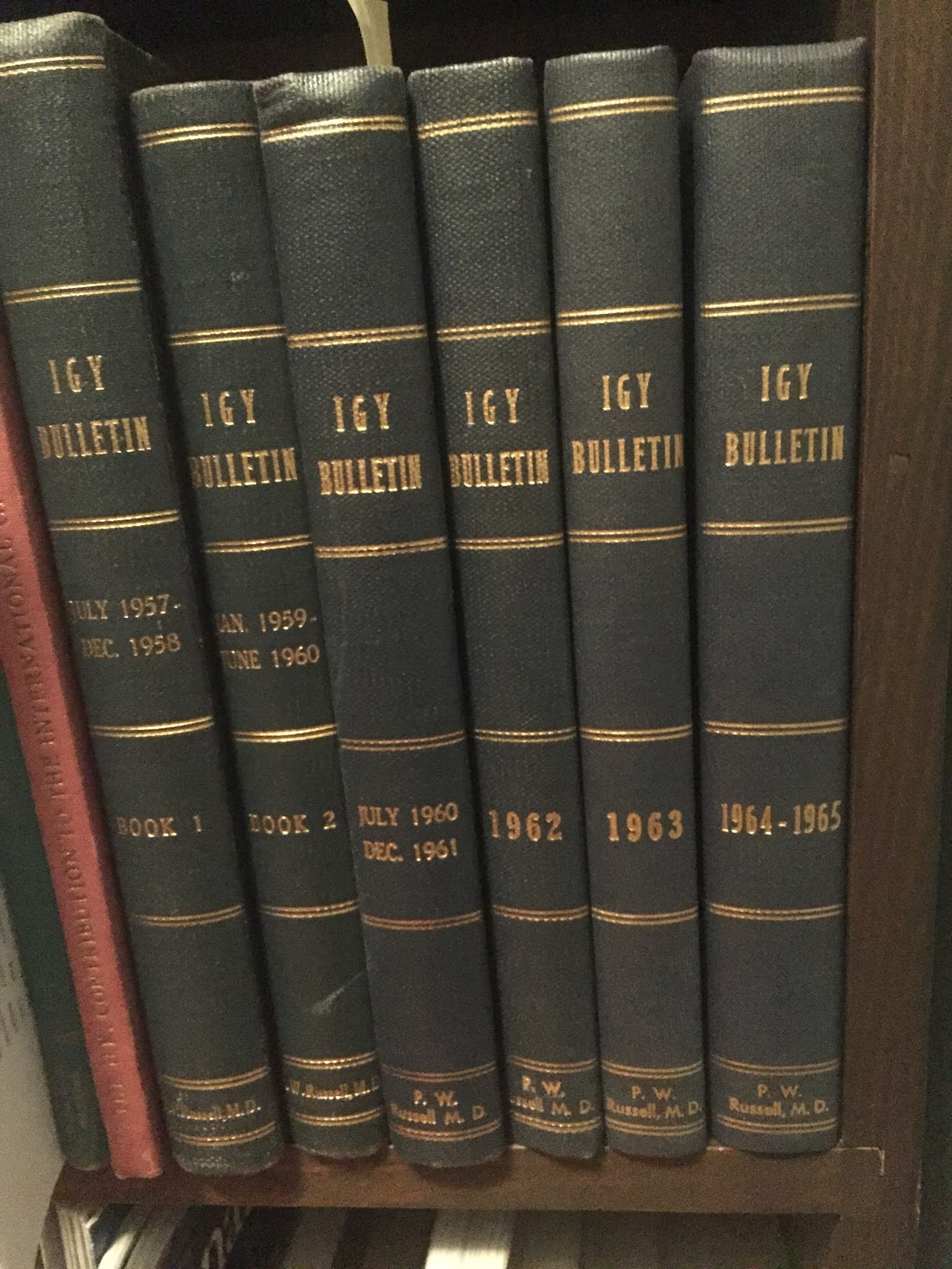 |
| My bound set of IGY Bulletins |
Keeling's first set of results are in issue #38, Aug. 1960, p. 8-11. I have scanned it as a pdf (sorry about the edge effects of the bound volume).
Three figures from this paper are worth showing below. Keeling was on the way to establishing one of many synoptic data sets collected during the IGY, with simultaneous measurements made at multiple stations around the world to better establish global patterns.


Now, with considerably more data, this animation from NOAA
clearly shows these patterns of historic increase in atmospheric carbon dioxide, aka the iconic Keeling curve. As the animation begins in 1980, you can see the seasonal oscillation of about 5 ppm (parts per million) in the northern hemisphere due to vegetation changes, and the long-term increase of about 2 ppm/year at both Mauna Loa, Hawaii, and in Antarctica (no regional vegetation, so little seasonal change), due largely to the burning of fossil fuel. The older, post-IGY, Keeling data show up in green after the animation reaches the year 2014, followed by even older results in orange that were derived from measurements of carbon dioxide extracted from pores in dated layers of glacial ice from Antarctica ice cores. The CO2 concentration has increased from a pre-industrial level of about 280 ppm to a 1958 level of 315 ppm to over 400 ppm today, a rise of about 30% since the IGY!
This clip from the American Museum of Natural History reviews the development of the Keeling curve. As shown at the end, what policies we follow in the near future will profoundly determine levels of atmospheric carbon dioxide reached by the end of the current century.
As this animation shows, the mean global temperature has risen in a highly correlated way with CO2 increases.
This is in general theoretical accordance with greenhouse effect predictions made already in the late 1800s by the Swedish Nobel Prize winning chemist Svante Arrhenius.
Data and data visualization can be beautiful, even if the inferences drawn may be sobering.
No comments:
Post a Comment